Switched to bootstrap theme
I finally gave up and drank the cool-aid of the Bootstrap theme. The main reason was that I noticed the site was basically unusable on any mobile device, including tablet computers like the iPad, which are unfortunately very, very common. Phones wouldn't render the site in a legible way either, unfortunately. The change is rather drastic, so I figured it was important to mention it here.
I am not so satisfied pretty exctied with the result: the theme is very basic, if not absent. I actually like that purified form now, and it works
across devices now much better.
But I do feel I just made my blog look like everyone else that uses Bootstrap. We seem to enter an era where non-graphic designers (like me) are back to building web pages that all look the same, not very different, in a way, from the old days of plain HTML, like the default ikiwiki theme. I did some work to change the look at least minimally, but the top black navbar is really a killer giveaway this is a bootstrap theme. Bootstrap does a lot for the typography, at least when checking the presslabs checklist or the practical typography checklist, but I still had to change the main body width, which helped a lot I think.
Anyways, the old Night City theme is still available for download and I could still flip it back on here if I need to.
What changed
The new theme keeps the distractions away, but ironically, it's slower than the previous theme even though there are no images and basically no colors at all. On my tests, it now loads in about 3.42 seconds on the "Regular 2G (250Kbps)" simulation of Chromium with 72KB in 12 requests. Whereas my tests with the previous theme were taking 3.25 seconds with 43.5KB in 17 requests. This is due to the Bootstrap CSS, which takes a whopping 19KB itself, but especially because I now load JQuery, which takes a whopping 32.8KB! And that is probably gzip-compressed, as the original is more around 90KB.
But at least the thing is readable on phones and tablets now. Compare:
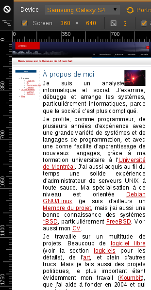
Samsung S3, before
Samsung S3, after
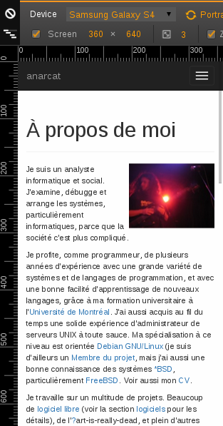
I like this: much simpler, purer version on smaller devices. And we see what counts: the freaking text.
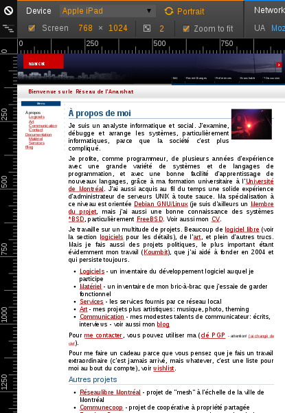
Of course, on tablets, it doesn't fare as well: the top menu gets wrapped around...
Apple iPad, before
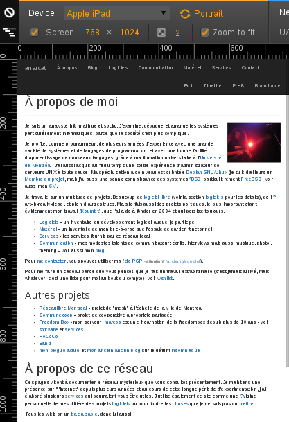
Apple iPad, after
Apparently, the fix would be for me to "customize the @grid-float-breakpoint variable" in LESS (which I thought was a pager, but seems to be a CSS preprocessor, graaah).
Still, I think it's better that way, more readable, and less crufty.
https://getbootstrap.com/components/#navbar
How it was done
After doing a thorough evaluation of all the Bootstrap ikiwiki themes I could find (there are more than 4 at least!), I figured I prefered the Jak Linux one. It seemed to be better implemented than the others, cleaner, and I liked the mean black border on top. Black is cool. Oh, and I liked the subtle footer as well. Subtle is cool.
Unfortunately, that theme originally required a custom plugin to have a menu on top, which i thought was silly. So I patched it to make it work with the sidebar plugin, which turned out to be trivially simple: just dump the sidebar content, and make the sidebar page have explicit HTML tags in it that match Bootstrap's required classes. I also added the regular action links in the top navbar, but that does overload it quite a bit. I also did some code cleanups and various other small changes, all of which are available in my personnal git repo.
https://ikiwiki.info/tips/bootstrap_themes_evaluation/?updated
What doesn't work
So of course, there are always problems. The first problem is the extra bandwidth usage. Not sure that can be fixed, other than switching to the upcoming Bootstrap 4, which is smaller than Bootstrap 3, bizarrely.
https://news.ycombinator.com/item?id=10086797
The more annoying problems are weird alignment issues. If the screen
gets two narrow without kicking some collapse rules in place (the iPad
bug above), the navbar rows overflow and look ugly. Even more bizarre,
in some cases the right navbar can just completely disappear, in fact,
that's the only fix I could find: to assign the hidden-xs and
hidden-sm classes to the navbar-right <UL> element. But then it
just goes away, which is pretty darn stupid. Still - I assigned the
classes to a few actions that seemed low priority, both in the theme
and in the sidebar page.
Similarly, the search form at the bottom of the page doesn't seem to
want to fit in the footer properly. No idea why and I can't bother to
figure that one out. I ended up merging this with the backlinks,
tags and trails navigation items.
Oh, and amazingly enough: comments are simply not rendered at all
right now. Oops. I seemed to have picked the single bootstrap Ikiwiki
theme that does not have comments rendering... Aaaargh. For now I
just copy-pasted stuff from the ramseydsilva theme and it looks
pretty ugly, but at least it works. I ended up theming comments the
same way i did for Night City, which looks pretty good, but is not in sync
with the LESS stuff in Bootstrap.
I also add to add back trails, backlinks and favicon... looks like the Jak theme wasn't made for a blog after all... but that's now fixed! 
Another improvement would be to change the font from the canonical Helvetica to something prettier, like suggested in Practical Typography, in the font recommendations section, or the presslabs checklist. So far I have settled on Mozilla's Fira font (which means, yes, one set of objects is actually loading from the CDN, sorry). Feedback welcome.
Yes, the theme was not considered for blogs. It was just a quick hack to get my website working. That's also a reason why it's not published separately.
It's also MIT licensed, not CC-BY-SA licensed, as the LICENSE file states in its second section (the content being the CC licensed part). You removed that file, thus violating its conditions. You do want to fix that.
The sidebar thing looks interesting, do you have your sidebar class change thingy?
I have restored the LICENSE file, sorry about that, I obviously didn't look properly at the license of everything. I have removed the copyright reference to you in the footer, because it was getting crowded down there (and i didn't want to advertise for Twitter). I believe the Expat license doesn't explicitly require that we advertise the original source(s) in the product's user interface, so I think that's fair game (otherwise you'd also be infringing twitter on your own site, I believe). A blurb is still in the HTML source however, to give proper credit.
The sidebar thing is pretty trivial: i just inject the sidebar content straight up there in the navbar. Then the sidebar plugin is enabled, and i made a sidebar page at the root of the site, which you can look at the source of - it's pretty trivial. It just has the same classes as a regular navbar.
search was finally fixed by integrating it in a bottom footer navbar, which also now contains the trail much better, leaving the bottom colophon footer much cleaner.
ideally, tags and links would also end up in this navbar, but you got to stop somewhere...
Hi, something is wrong, I'm afraid. When you zoom (crtl++ in firefox) this page:
http://i.imgur.com/7QCHn7v.png
The menu is partially disappearing:
http://i.imgur.com/2L0Kntm.png
hidden-smclass assigned, which makes them disappear on what Bootstrap considers to be "small screens". Otherwise, things would overflow on multiple columns. this is fairly well documented in bootstrap, but is arguably a limitation: a best solution would be for bootstrap to throw those items in a submenu, but i'm really not going to bother with that, as those items can be found on the home page anyways.someone made a new theme, based on bootstrap 4, which is also relevant here.
see ikistrap
The so called "MIT License" doesn't require any reference to original sources at all.
Regarding bootstrap itself, the fact that you are laming up your website is an enough tradeoff, so the less you credit them the better.
As for the resizing problem, I've experimented with this with no luck and worse results.
I'm not sure where in the docs I've come up, but I have made this commit which fixed this website and you may resize the screen to see how it went.
I'm still using this theme, but it moved to Gitlab. I also updated it to jquery 3.x and the latest bootstrap recently.
I'm considering my options for Bootstrap alternatives. jQuery, in particular, seems like a huge liability nowadays. I found 3 undocumented vulnerabilities (no CVE, fixed) I was affected by so I will look at other options next time I go crazy and want to rebuild the theme here. Those I know of:
There are probably a billion more, options of course. Sigh.