Playing with fonts again
I am getting increasingly frustrated by Fira Mono's lack of italic support so I am looking at alternative fonts again.
Commit Mono
This time I seem to be settling on either Commit Mono or Space
Mono. For now I'm using Commit Mono because it's a little more
compressed than Fira and does have a italic version. I don't like how
Space Mono's parenthesis (()) is "squarish", it feels visually
ambiguous with the square brackets ([]), a big no-no for my primary
use case (code).
So here I am using a new font, again. It required changing a bunch of configuration files in my home directory (which is in a private repository, sorry) and Emacs configuration (thankfully that's public!).
One gotcha is I realized I didn't actually have a global font configuration in Emacs, as some Faces define their own font family, which overrides the frame defaults.
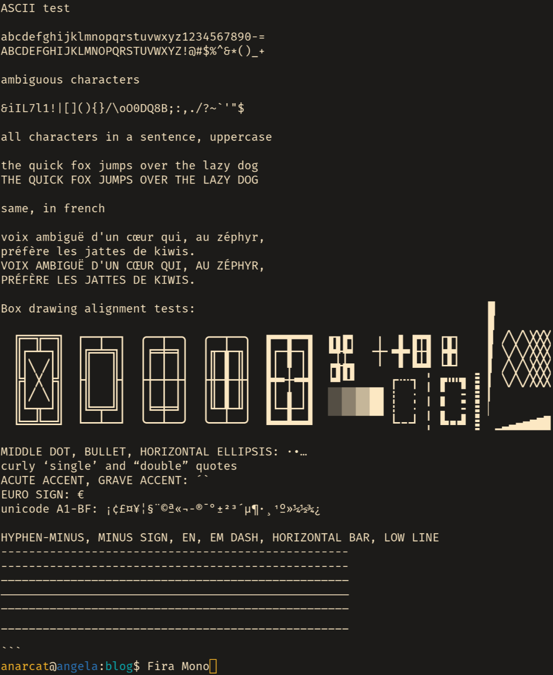
This is what it looks like, before:
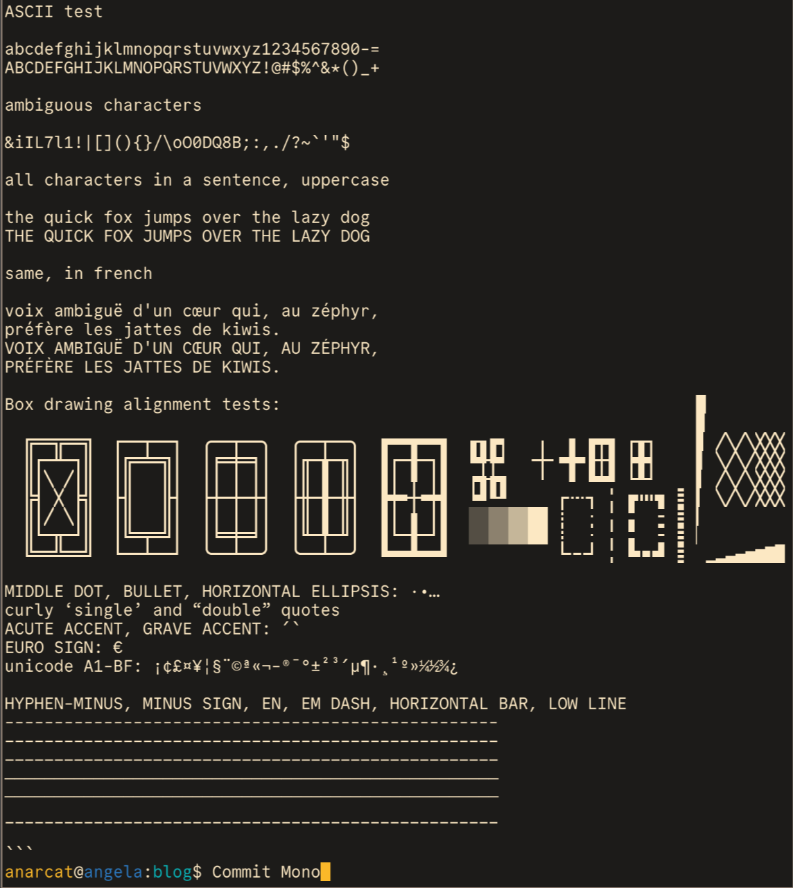
After:
(Notice how those screenshots are not sharp? I'm surprised too. The originals look sharp on my display, I suspect this is something to do with the Wayland transition. I've tried with both grim and flameshot, for what its worth. Update: turns out this is a really complicated issue having to do with displaying images as well as screenshots, see the issues in shotman and grim.)
And here is an update of those in a single screenshot with the new test sheet:
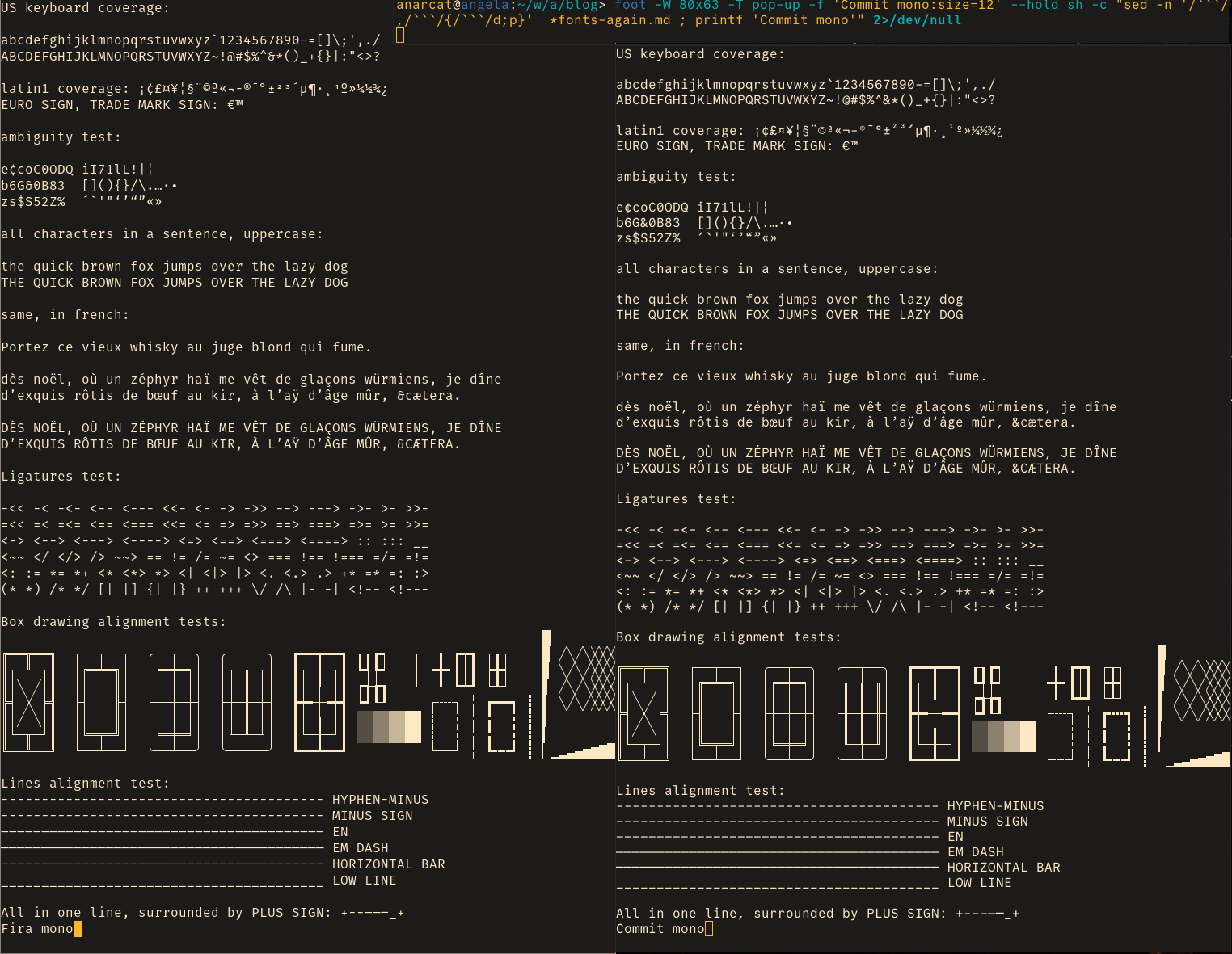
foot -W 80x63 -T pop-up -f 'Commit mono:size=12' --hold sh -c
"sed -n '/```/,/```/{/```/d;p}'  *fonts-again.md ; printf 'Commit
mono'" 2>/dev/null
and foot -W 80x61 -T pop-up -f 'Fira
mono:size=12' --hold sh -c "sed -n '/```/,/```/{/```/d;p}'
*fonts-again.md ; printf 'Fira mono'" 2>/dev/null.
They are pretty similar! Commit Mono feels a bit more vertically compressed maybe too much so, actually -- the line height feels too low. But it's heavily customizable so that's something that's relatively easy to fix, if it's really a problem. Its weight is also a little heavier and wider than Fira which I find a little distracting right now, but maybe I'll get used to it.
All characters seem properly distinguishable, although, if I'd really
want to nitpick I'd say the © and ® are too different, with the
latter (REGISTERED SIGN) being way too small, basically unreadable
here. Since I see this sign approximately never, it probably doesn't
matter at all.
I like how the ampersand (&) is more traditional, although I'll miss
the exotic one Fira produced... I like how the back quotes (`,
GRAVE ACCENT) drop down low, nicely aligned with the apostrophe. As
I mentioned before, I like how the bar on the "f" aligns with the
other top of letters, something in Fira mono that really annoys me now
that I've noticed it (it's not aligned!).
A UTF-8 test file
Here's the test sheet I've made up to test various characters. I could have sworn I had a good one like this lying around somewhere but couldn't find it so here it is, I guess.
US keyboard coverage:
abcdefghijklmnopqrstuvwxyz`1234567890-=[]\;',./
ABCDEFGHIJKLMNOPQRSTUVWXYZ~!@#$%^&*()_+{}|:"<>?
latin1 coverage: ¡¢£¤¥¦§¨©ª«¬®¯°±²³´µ¶·¸¹º»¼½¾¿
EURO SIGN, TRADE MARK SIGN: €™
ambiguity test:
e¢coC0ODQ iI71lL!|¦
b6G&0B83 [](){}/\.…·•
zs$S52Z% ´`'"‘’“”«»
all characters in a sentence, uppercase:
the quick brown fox jumps over the lazy dog
THE QUICK BROWN FOX JUMPS OVER THE LAZY DOG
same, in french:
Portez ce vieux whisky au juge blond qui fume.
dès noël, où un zéphyr haï me vêt de glaçons würmiens, je dîne
d’exquis rôtis de bœuf au kir, à l’aÿ d’âge mûr, &cætera.
DÈS NOËL, OÙ UN ZÉPHYR HAÏ ME VÊT DE GLAÇONS WÜRMIENS, JE DÎNE
D’EXQUIS RÔTIS DE BŒUF AU KIR, À L’AŸ D’ÂGE MÛR, &CÆTERA.
Ligatures test:
-<< -< -<- <-- <--- <<- <- -> ->> --> ---> ->- >- >>-
=<< =< =<= <== <=== <<= <= => =>> ==> ===> =>= >= >>=
<-> <--> <---> <----> <=> <==> <===> <====> :: ::: __
<~~ </ </> /> ~~> == != /= ~= <> === !== !=== =/= =!=
<: := *= *+ <* <*> *> <| <|> |> <. <.> .> +* =* =: :>
(* *) /* */ [| |] {| |} ++ +++ \/ /\ |- -| <!-- <!---
Box drawing alignment tests:
█
╔══╦══╗ ┌──┬──┐ ╭──┬──╮ ╭──┬──╮ ┏━━┳━━┓ ┎┒┏┑ ╷ ╻ ┏┯┓ ┌┰┐ ▉ ╱╲╱╲╳╳╳
║┌─╨─┐║ │╔═╧═╗│ │╒═╪═╕│ │╓─╁─╖│ ┃┌─╂─┐┃ ┗╃╄┙ ╶┼╴╺╋╸┠┼┨ ┝╋┥ ▊ ╲╱╲╱╳╳╳
║│╲ ╱│║ │║ ║│ ││ │ ││ │║ ┃ ║│ ┃│ ╿ │┃ ┍╅╆┓ ╵ ╹ ┗┷┛ └┸┘ ▋ ╱╲╱╲╳╳╳
╠╡ ╳ ╞╣ ├╢ ╟┤ ├┼─┼─┼┤ ├╫─╂─╫┤ ┣┿╾┼╼┿┫ ┕┛┖┚ ┌┄┄┐ ╎ ┏┅┅┓ ┋ ▌ ╲╱╲╱╳╳╳
║│╱ ╲│║ │║ ║│ ││ │ ││ │║ ┃ ║│ ┃│ ╽ │┃ ░░▒▒▓▓██ ┊ ┆ ╎ ╏ ┇ ┋ ▍
║└─╥─┘║ │╚═╤═╝│ │╘═╪═╛│ │╙─╀─╜│ ┃└─╂─┘┃ ░░▒▒▓▓██ ┊ ┆ ╎ ╏ ┇ ┋ ▎
╚══╩══╝ └──┴──┘ ╰──┴──╯ ╰──┴──╯ ┗━━┻━━┛ └╌╌┘ ╎ ┗╍╍┛ ┋ ▏▁▂▃▄▅▆▇█
Lines alignment test:
---------------------------------------- HYPHEN-MINUS
−−−−−−−−−−−−−−−−−−−−−−−−−−−−−−−−−−−−−−−− MINUS SIGN
–––––––––––––––––––––––––––––––––––––––– EN
———————————————————————————————————————— EM DASH
―――――――――――――――――――――――――――――――――――――――― HORIZONTAL BAR
________________________________________ LOW LINE
All in one line, surrounded by PLUS SIGN: +-−–—―_+
Update: here is another such sample sheet, it's pretty good and has support for more languages while being still relatively small.
So there you have it, got completely nerd swiped by typography again. Now I can go back to writing a too-long proposal again.
Sources and inspiration for the above:
the
unicode(1)command, to lookup individual characters to disambiguate, for example,-(U+002D HYPHEN-MINUS, the minus sign next to zero on US keyboards) and − (U+2212 MINUS SIGN, a math symbol)searchable list of characters and their names - roughly equivalent to the
unicode(1)command, but in one page, amazingly the/usr/share/unicodedatabase doesn't have any one file like thisbits/UTF-8-Unicode-Test-Documents - full list of UTF-8 characters
UTF-8 encoded plain text file - nice examples of edge cases, curly quotes example and box drawing alignment test which, incidentally, showed me I needed specific faces customisation in Emacs to get the Markdown code areas to display properly, also the idea of comparing various dashes
sample sentences in many languages - unused, "Sentences that contain all letters commonly used in a language"
UTF-8 sampler - unused, similar
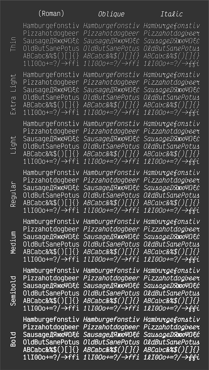
Other fonts
In my previous blog post about fonts, I had a list of alternative fonts, but it seems people are not digging through this, so I figured I would redo the list here to preempt "but have you tried Jetbrains mono" kind of comments.
My requirements are:
- no ligatures: yes, in the previous post, I wanted ligatures but I have changed my mind. after testing this, I find them distracting, confusing, and they often break the monospace nature of the display (note that some folks wrote emacs code to selectively enable ligatures which is an interesting compromise)z
- monospace: this is to display code
- italics: often used when writing Markdown, where I do make use of italics... Emacs falls back to underlining text when lacking italics which is hard to read
- free-ish, ultimately should be packaged in Debian
Here is the list of alternatives I have considered in the past and why I'm not using them:
agave: recommended by tarzeau, not sure I like the lowercase
a, a bit too exotic, packaged as fonts-agaveCascadia code: optional ligatures, multilingual, not liking the alignment, ambiguous parenthesis (look too much like square brackets), new default for Windows Terminal and Visual Studio, packaged as fonts-cascadia-code
Fira Code: ligatures, was using Fira Mono from which it is derived, lacking italics except for forks, interestingly, Fira Code succeeds the alignment test but Fira Mono fails to show the X signs properly! packaged as fonts-firacode
Julia Mono: ligatures (can be disabled), good alternative, good unicode coverage, seems to pass most tests, italics, even better than Commit mono at alignment (in the dash test, Commit mono's
HORIZONTAL BARis misaligned or missing)Hack: no ligatures, very similar to Fira, italics, good alternative, fails the X test in box alignment, packaged as fonts-hack
Hermit: no ligatures, smaller, alignment issues in box drawing and dashes, packaged as fonts-hermit somehow part of cool-retro-term
IBM Plex: irritating website, replaces Helvetica as the IBM corporate font, no ligatures by default, italics, proportional alternatives, serifs and sans, multiple languages, partial failure in box alignment test (X signs), fancy curly braces contrast perhaps too much with the rest of the font, packaged in Debian as fonts-ibm-plex
Inconsolata: no ligatures, maybe italics? more compressed than others, feels a little out of balance because of that, packaged in Debian as fonts-inconsolata
Intel One Mono: nice legibility, no ligatures, alignment issues in box drawing, not packaged in Debian
Iosevka: optional ligatures, italics, multilingual, good legibility, has a proportional option, serifs and sans, line height issue in box drawing, fails dash test, not in Debian
Jetbrains Mono: (mandatory?) ligatures, good coverage, originally rumored to be not DFSG-free (Debian Free Software Guidelines) but ultimately packaged in Debian as fonts-jetbrains-mono
Monoid: optional ligatures, feels much "thinner" than Jetbrains, not liking alignment or spacing on that one, ambiguous
2Z, problems rendering box drawing, packaged as fonts-monoidMononoki: no ligatures, looks good, good alternative, suggested by the Debian fonts team as part of fonts-recommended, problems rendering box drawing, em dash bigger than en dash, packaged as fonts-mononoki
Server mono: no ligatures, italics, old school
Source Code Pro: italics, looks good, but dash metrics look whacky, not in Debian
spleen: bitmap font, old school, spacing issue in box drawing test, packaged as fonts-spleen
sudo: personal project, no ligatures, zero originally not dotted, relied on metrics for legibility, spacing issue in box drawing, not in Debian
victor mono: italics are cursive by default (distracting), ligatures by default, looks good, more compressed than commit mono, good candidate otherwise, has a nice and compact proof sheet
So, if I get tired of Commit Mono, I might probably try, in order:
- Hack
- Jetbrains Mono
- IBM Plex Mono
Iosevka, Monoki and Intel One Mono are also good options, but have
alignment problems. Iosevka is particularly disappointing as the EM
DASH metrics are just completely wrong (much too wide).
Other tricks
The above was tested using the Programming fonts site which has all the above fonts, which cannot be said of Font Squirrel or Google Fonts, amazingly. Other such tools:
- Coding Font (broken in Firefox as of 2024-05-30)
- dev fonts comparator
- Font Squirrel
- Google Fonts
- Programming fonts
Also note that there is now a package in Debian called fnt to manage fonts like this locally, including in-line previews (that don't work in bookworm but should be improved in trixie and later).
Finally, you can list all currently available fonts with:
fc-list ':' file
The : string essentially means "everything" and is only there to
pass the second file parameter which says "only print filenames".
You can use your Mastodon account to reply to this post.